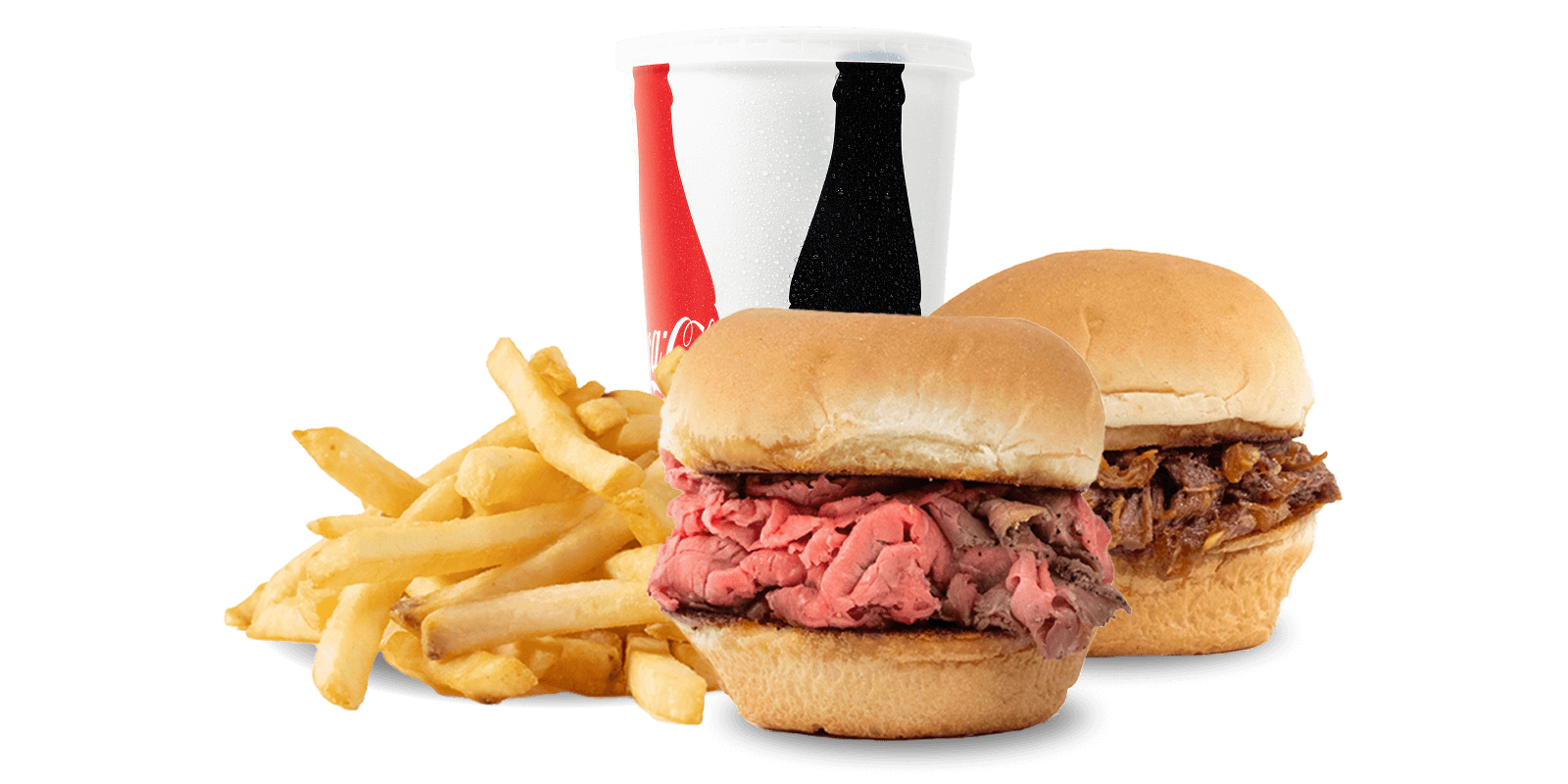
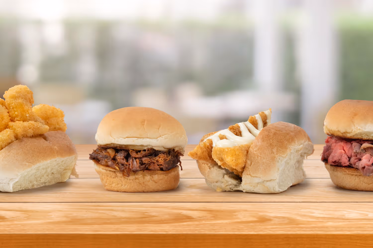
SLIDER MEAL DEALS STARTING AT $5.99
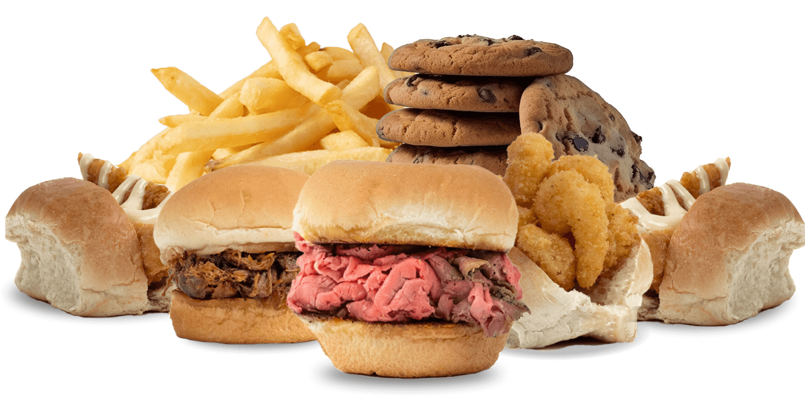
GET THE FAMILY MEAL DEAL FOR $26.99

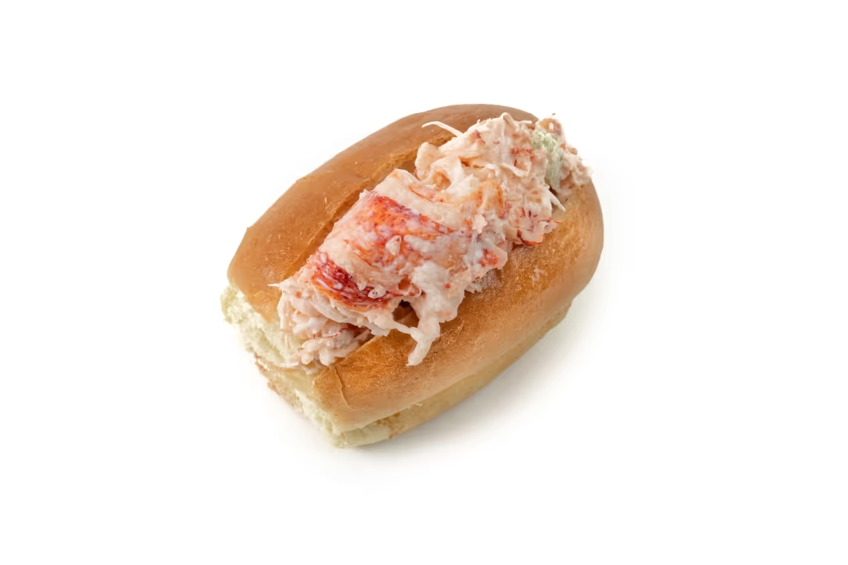
Roast Beef Sandwiches Our Way
We didn’t just make the roast beef 3-way sandwich famous. We started it. 75 years later, we’re still slicing it thin on the daily and stacking it high on rolls from our favorite North Shore bakeries. Some traditions never get old.
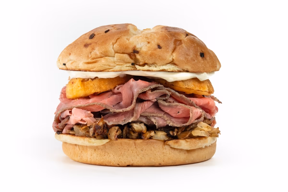


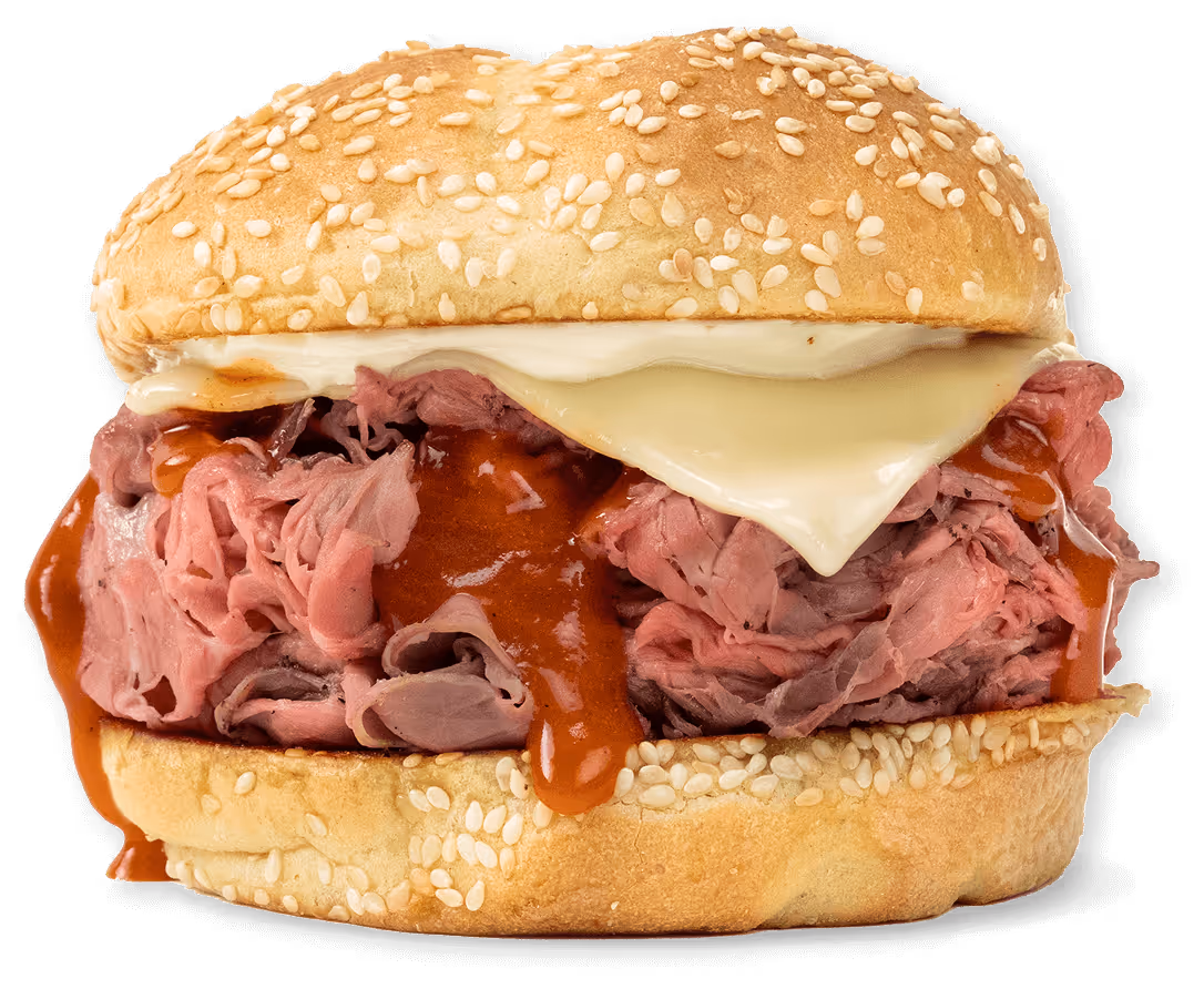
The Classics
The North Shore favorites that started a legacy, prepared fresh daily. Order a classic Roast Beef 3-Way, just like the legends intended it. Or make it your own. We built it our way. Now it’s your turn.


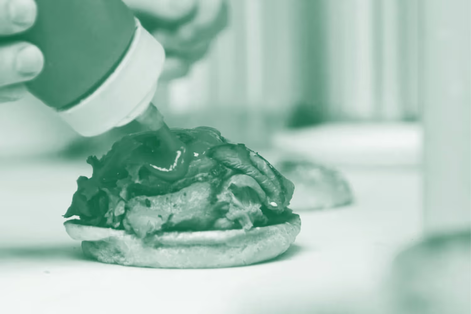
Catering with Kelly’s
Customizable for groups of 5 to 1,000, our catering menu features oversized platters packed with roast beef, seafood, sandwiches, and more. Just unwrap, eat, and enjoy. Get in touch for crowd-pleasers made to order for your next event.
Promos & Events
Not available at Airport location.

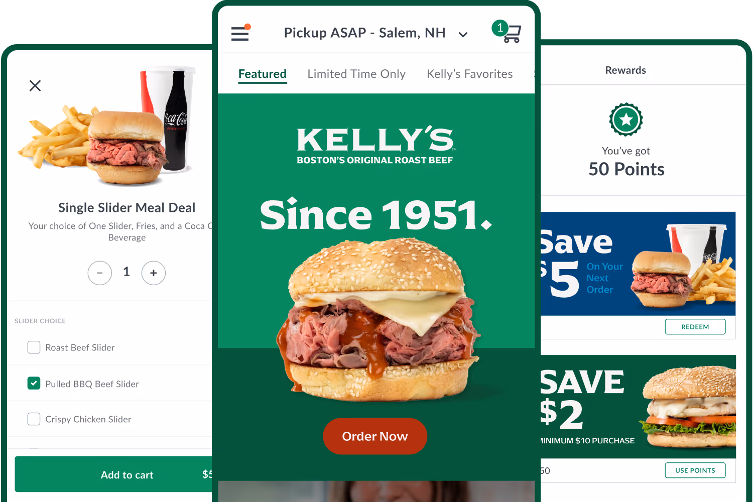
Download the Kelly's App & Get Rewards
Order your favorites. Earn rewards. There's never been a tastier win-win.